Anyhoo...
The dining room was actually in pretty good shape. With the exception of the carpet. I don't understand why people put carpet in dining rooms. I really don't. We did it once. Don't know why. I do know that it will never. happen. again.
We ripped out the carpet, took all trim off (not just in here, but the whole house!), and painted the walls a simple tan (Behr - Gobi Desert). Then, we installed a beautiful maple hardwood floor. (We hired this out and it was one of the best decisions we made during this process!) After the floors were down, the nice, clean, white trim went up! I love white trim. Makes every color pop! We also spray painted all of the dark wood window frames white. It was a pain in the you-know-what, but they look brand new!
(Have I told you when I say "we," I really mean my wunnferful hubby? No? Huh.)
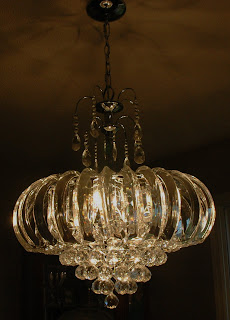
Not bad! We are getting there. But I wasn't in love with the light fixture. It was just OK. A perfectly nice fixture. I wanted something with a little more personality than "perfectly nice." And, when you walk in the front door, you see all the way through to the dining room. The existing fixture was dark and low and your eyes stopped at it. It also made the already low ceilings seem even lower.
Enter sparkly-acrylic lovelieness. Fantabulous! I love it. (Who knew you could fall in love with a light fixture?!) It doesn't obstruct your line of vision. It also makes the ceiling seem much higher. And, as an added bonus, it makes rainbows on the walls! Perfecto!
We've only got bare bones furniture in there now, but it's functional. I've got some ideas on how to liven it up. I think we are going to eventually move the buffet onto a different wall and get a skinnier side table to replace it. It's a bit of a tight squeeze now to get drawers open. We may also had a tall wine rack in the corner to balance out the curio in the opposite corner. Do you like the highchair? I was too lazy to take it off to take pictures.
We are soooo happy with the way it turned out!
I can't decide which room to show you next...family room? master bedroom? kitchen? mudroom? Decisions, decisions.
It's supposed to be rainy and crappy here this weekend. Yay! Not. But, it does give me the chance to hopefully get some crafty projects done.


mudroom please. :)
ReplyDeleteLooks great!! I would love to see any and all of the remakes!!
ReplyDelete